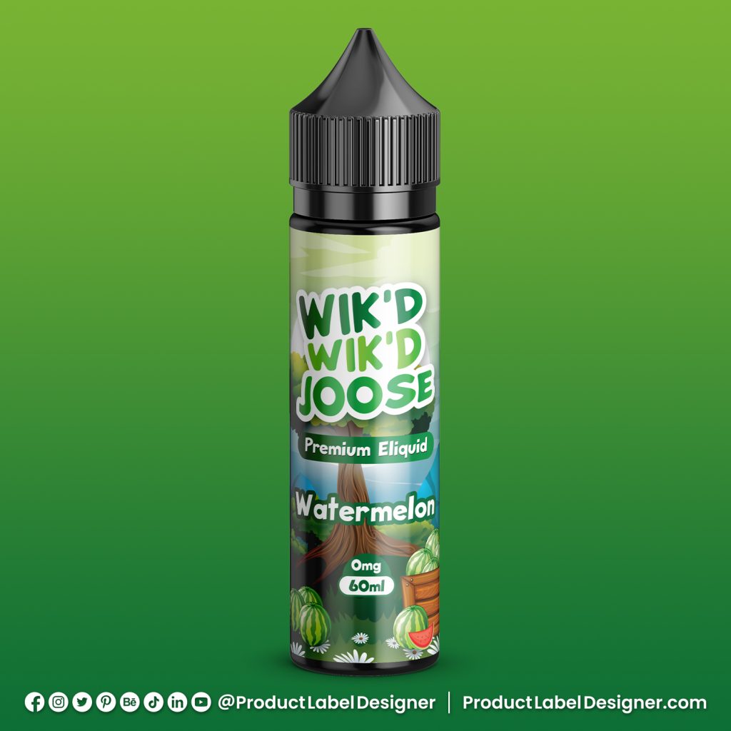
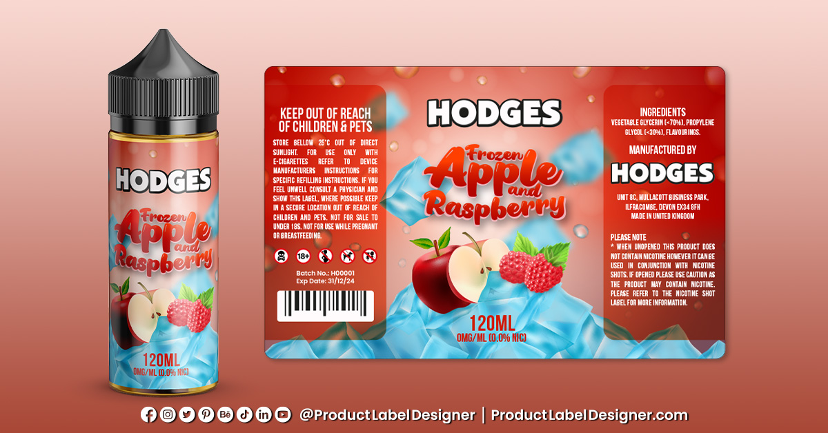
Vape E-Liquid Bottle Label Design for 10 Flavour Range
A Deep Dive into Crafting Striking Vape E-Liquid Bottle Label Design for a Diverse 10 Flavour Range
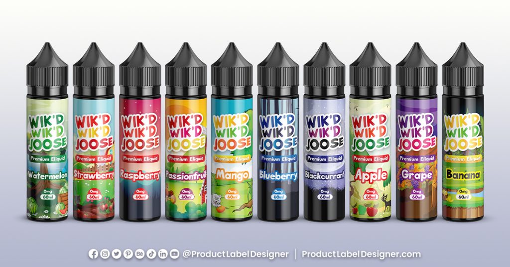
Understanding the Flavor Palette:
The foundation of any successful vape label design lies in a profound understanding of the flavors encapsulated within. For a 10-flavor range, this involves immersing oneself in the nuances of each variant, from bold tobacco blends to fruity concoctions. This understanding becomes the cornerstone upon which the visual story is built.
Harnessing Illustrator’s Precision:
Adobe Illustrator becomes the virtual canvas for precision detailing. Its vector capabilities ensure that every element, from intricate illustrations to the smallest text, is rendered with sharp clarity. This precision is particularly crucial when dealing with a diverse flavor range, ensuring that each label maintains a consistent standard of quality.
Photoshop’s Artistic Canvas:
Switching gears to Adobe Photoshop introduces a layer of artistic flair. Here, vibrant colors, textures, and visual elements come to life. Each flavor’s personality is translated into the visual realm, utilizing Photoshop’s versatility to create labels that not only represent the taste but also entice visually.
Color Palette Dynamics:
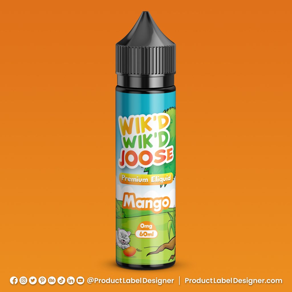
Choosing a color palette is an art in itself. The 10-flavor range demands a spectrum that not only reflects the diversity of the flavors but also establishes a brand identity. From soothing blues for minty coolness to warm oranges for tropical blends, the color palette becomes a visual cue for the vaper, setting expectations for the sensory journey that awaits.
Typography: Balancing Aesthetics and Readability:
Typography plays a dual role—enhancing aesthetics and ensuring crucial information is communicated effectively. Carefully selected fonts strike a balance between visual appeal and readability, ensuring that flavor specifics, nicotine strength, and safety warnings are presented with clarity.
Logo Integration: Symbolism and Brand Cohesion:
The brand’s logo is not just an emblem; it’s a symbol that ties together the essence of the entire flavor range. Integrated seamlessly into the label design, it becomes a visual anchor—a promise of quality and consistency that transcends individual flavors, fostering brand cohesion.
Illustrative Elements: Crafting a Visual Story:
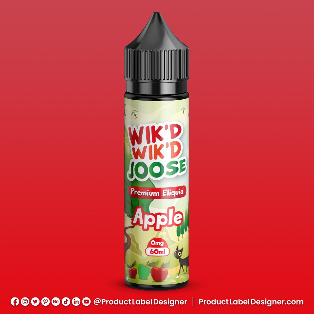
High-resolution illustrations breathe life into the labels. Whether it’s the crispness of an apple or the lushness of a tropical forest, these visual elements tell a story, inviting users to embark on a sensory journey. Photoshop’s capabilities shine here, offering a canvas for crafting intricate and captivating visuals.
Texture and Finish Selection: Engaging the Senses:
To enhance the tactile experience, texture and finish selection is pivotal. Photoshop introduces subtle textures that add depth to the label, while the choice between matte and gloss finishes provides a tactile quality. Engaging not only the eyes but also the sense of touch, this step elevates the overall user experience.
Regulatory Compliance: Art Meets Responsibility:
Nestled within the artistic endeavor is a commitment to responsibility. Regulatory compliance is seamlessly integrated, ensuring that safety warnings and essential information are presented without compromising the visual aesthetic. This demonstrates that art and responsibility can coexist harmoniously.
Mockups and Realism: Bridging the Digital-Physical Gap:
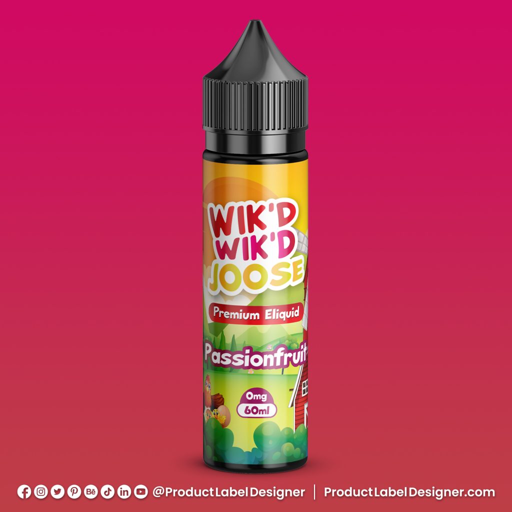
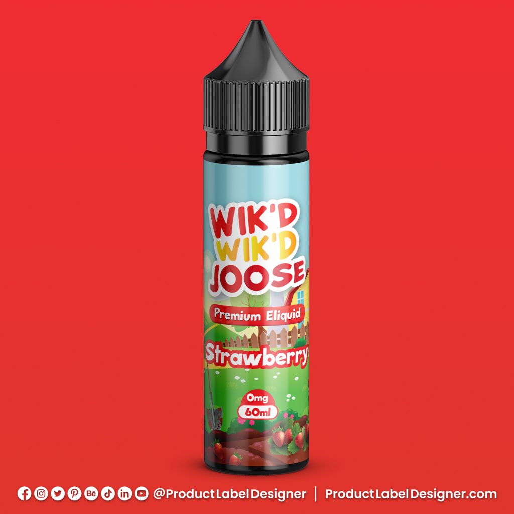
Creating realistic mockups through Photoshop is a crucial step. These mockups allow stakeholders to visualize how the labels will manifest on the physical e-liquid bottles, offering a tangible preview of the final product. It’s a bridge between the digital design realm and the physical reality of the vaping experience.
Feedback, Refinement, and Evolution:
The design process is iterative, and feedback from peers and clients becomes instrumental. Each round of input contributes to refinements, ensuring that the final design is a culmination of collaborative creativity and perfection. It’s a journey of evolution toward excellence.
Conclusion: A Symphony of Flavor and Design:
As these professionally crafted vape juice labels find their place in the 10-flavor range portfolio, they stand as more than just labels—they are visual symphonies. Each label is an invitation, a prelude to the flavorful experience within the bottle. The meticulous fusion of Illustrator’s precision and Photoshop’s artistry creates not just labels but visual stories that resonate with vapers, making the journey as delightful as the destination.
In a landscape where vaping is both a science and an art, these labels encapsulate the essence of both, offering users a sensorial journey that begins the moment they lay eyes on the label. This is the art of crafting visual narratives for a 10-flavor vape juice range—a harmonious blend of flavor and design that transcends the ordinary.
Category:
Design
Date:
20/01/2024


